The Design Philosophy Behind Highland Pro’s /Lookup Feature
Highland Pro’s /lookup provides short, inline answers. Building it required early design decisions.

Highland Pro shipped last week. We’ve had a great reception, including front-page placement on the Mac App Store.
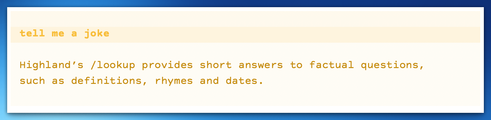
One of Highland Pro’s new features is /lookup, which provides short answers to questions a user might otherwise Google. Designing and implementing Highland Pro’s /lookup involved a lot of iteration. This is a write-up of how we got there.
What /lookup is for
When writing, I frequently find myself switching to Safari to find an answer to a question. It’s often a definition (“Am I using this word correctly?”) or related to a story point (“How long would it take to drive from Denver to Houston?”).
In theory, each jump over to Safari to Google something should only take 20 seconds or so. In practice, it’s much more disruptive. If I am in flow -- that happy state where I’m stringing together words easily, naturally -- shifting my focus to look something up has a good chance of breaking it. And there’s always the danger of falling into a search hole, where one question leads to another and then another.
Minutes evaporate. Then I start checking Slack, then email. Then it’s lunch.
So for me, the trick is to get the answer I need without leaving the context of writing. Ideally, I want to ask the question and get the answer right where I’m typing.
Notion, Slack and other apps use a forward slash to indicate that what follows is a command rather than normal text. That felt like a syntax worth using.
What to call it
When I first pitched this idea to my team, I called it /assist. I was envisioning it as a little research helper. But that term was far too broad.
To “assist” the user could mean “help me figure this out” or “do this thing for me.” Assist implied a kind of agency and personification -- an assistant who assists -- which wasn’t the intention.
After a few weeks, we settled on /lookup. I love it because it sounds like a function, not a friend. More importantly, it greatly reduces the scope of what a user expects out of it. Good design is about helping the user form a conceptual model of what something does. That starts with the name.
What /lookup should look like
Now that we had a name, we had to actually build the feature. You can read about how /lookup works on a technical level on our Support page. The short version is that it uses pre-built dictionaries for everything it can, switching off to a third-party LLM for answers it can’t find otherwise. But the design choices go significantly beyond server calls and JSON hand-offs.
For starters, we wanted to make sure the user knew they were in a special mode when they were making a /lookup. That’s why the slash and everything you type after it is gold.

When you get an answer back from /lookup, it’s also in gold, wrapped in special markup (%%) to indicate that the whole came from somewhere else. Any time you’re bringing in text you didn’t write yourself – including a sentence you copy-pasted from a web page – there’s the danger you’ll mistake it for your own writing. By making /lookup answers gold, we’re reminding the user, “Hey, these aren’t your words!”
We chose gold because it provided a consistent look across themes, including dark mode.
Getting an answer back from /lookup takes between one and five seconds. We experimented with progress bars, but ultimately stuck with the default system spinners. Everything else felt too heavy.
Most /lookups work well, but they can fail for a number of reasons. For example, we might not understand what you’re asking for, or fail to get a good answer. You might not be connected to the internet. We wrote responses for all these situations. In each one, we tried to reinforce /lookup’s purpose:
We added /help to offer guidance, particularly on which terms had special meaning.
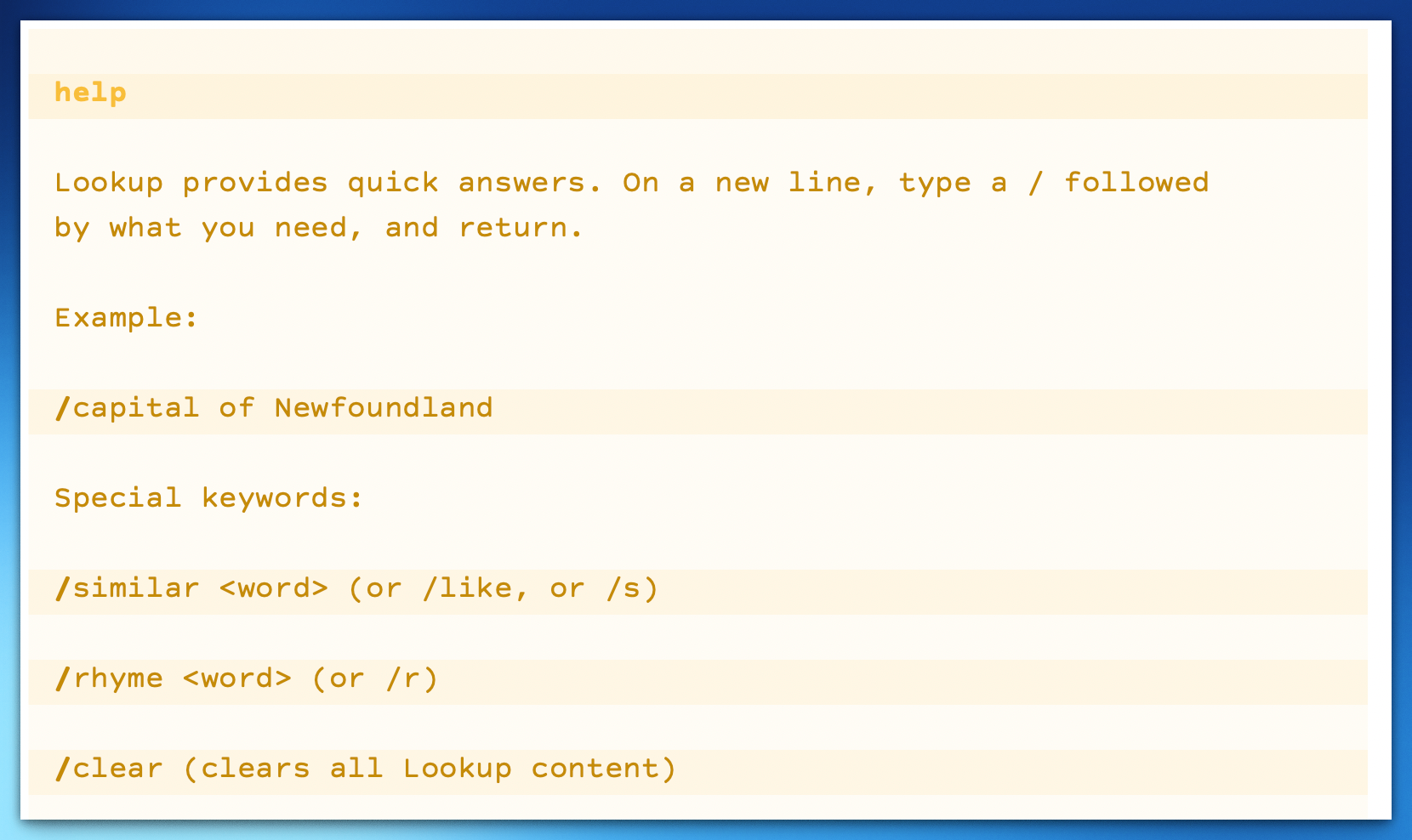
Finally, we added /clear as a command to sweep away every bit of /lookup text in the document. The goal is that you can ask your question, get your answer, then and back to typing without your fingers ever leaving your keyboard — and without your eyes moving away from the insertion point.
What /lookup should and shouldn’t do
We were able to get a prototype of /lookup running in just a few hours, but it took weeks of tweaking to get it feeling right.
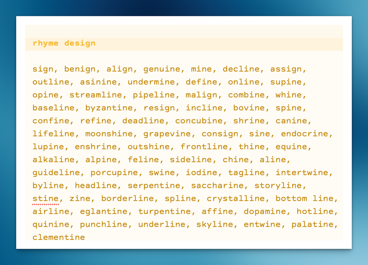
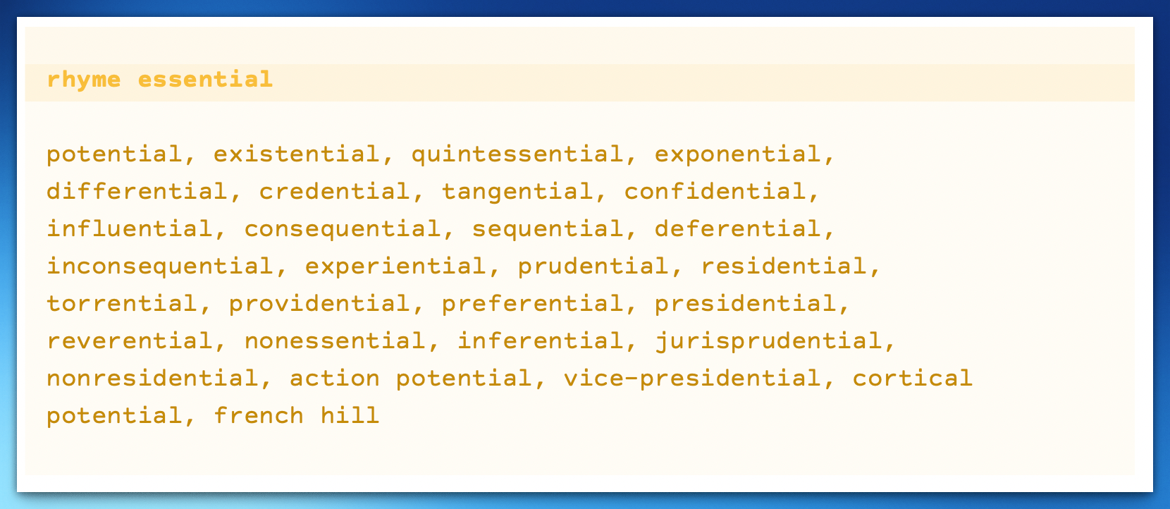
Initially, the biggest problem was that /lookup tended to give you way too much. Too many synonyms, too many rhymes, too much context. A tool meant to save you time was overloading you with things you didn’t ask for.
As with many design issues, the solution depended on the context. With synonyms and rhymes, the user isn’t looking for one specific answer, but a range of choices. So here, /lookup should still give you a lot of options. It’s easy to skim and find something useful.
For facts and definitions, the user just wants the answer. So here we aim for two sentences or under. (If you’re looking for more than that, you’re better off switching to Safari anyway.)
Our beta testers were largely happy with the results. Once they understood it wasn’t a chatbot – each /lookup is an independent request to a faceless encyclopedia – they saw its utility and predicted other writing apps would quickly copy it.
Users do things you don’t anticipate
Our Team Highland beta testers approached /lookup in the spirit it was intended. That was commendable, but in retrospect, insufficient.
A few days after we publicly launched, a user shared a screenshot showing /lookup generating a short (terrible) scene “in the style of John August.” It broke both the technical and design principles behind /lookup. Worse, it was reproducible!
Here, the user wasn’t performing some devious feat of prompt injection. Rather, he’d made the simple request for /lookup to write a scene, and that was apparently enough to smash through our two-sentence limit. The third-party LLM service tried to answer the non-question “write a scene” by spitting out text resembling a scene. Worse, /lookup fed that text back without checking if it met the criteria for an answer (i.e. a short answer to something you could Google).
We quickly closed that loophole, and others we discovered through trial and error. The fixes included stricter definitions on what “answers” could consist of, and putting a hard cap on the length of what could be returned to the user. Because the changes could be deployed instantly on our servers, we didn’t need to submit a new build to the App Store and wait for approval. We could deploy in minutes rather than days.
Still, I doubt it’s the last time we’ll need to tweak /lookup.
One of our goals with /lookup is to use whatever providers make the most sense. If we find a better rhyming dictionary, we’ll swap to it. If a different LLM can provide Wikipedia-quality answers quickly and accurately, we’ll use that. And as on-device knowledge increases, we may be able to provide more answers without hitting our servers at all.
Making these changes will require code changes, but I’m optimistic that the underlying design decisions behind Highland Pro’s /lookup will remain solid for years to come. From the user perspective, /lookup should still meet its initial brief: a quick, distraction-free answer while you’re writing.
Providing that – nothing more and nothing less – simply takes a lot of work.