Screenplay Font Guide: What Font Do Scripts Use and Why?


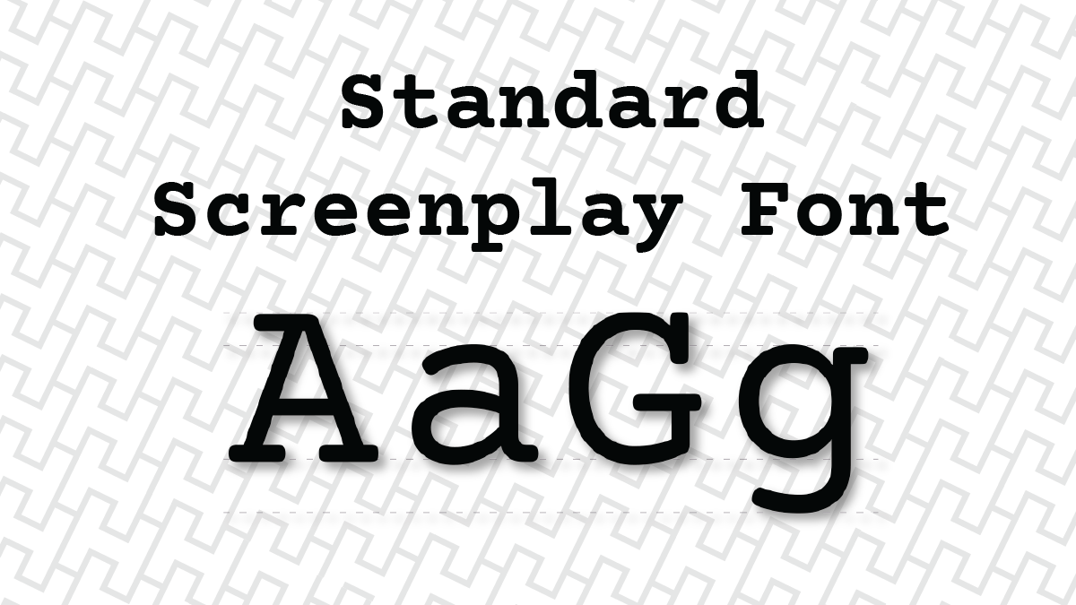
The standard screenplay font is 12-point Courier – or any close variant like Courier Prime, Courier New, or Courier Final Draft. This has been the industry standard since the era of mechanical typewriters, and it remains the rule today for a straightforward reason: Courier is a fixed-pitch font, meaning every character and space takes up exactly the same width on the page. That consistency matters for readability and for the practical business of estimating production schedules from a script.
Most screenwriting software defaults to Courier 12-point automatically, so if you're using Highland Pro, Final Draft, or Fade In you're already covered. The font question only becomes relevant when you're working outside dedicated software, downloading a font for a new machine, or trying to understand why the industry settled on this particular typeface.
If you encounter scripts written in other fonts — many bookstore editions and some drafts circulating online use different typefaces — that's a publishing or personal choice made after the script was sold. For any script you're submitting to agents, managers, competitions, or producers, use Courier 12-point.
What's the Difference Between Courier types?
All three are acceptable screenplay fonts, but they're not identical. Here's how they compare:
Courier is the original typewriter-derived font and the baseline all variants are measured against. Some older versions of Final Draft default to this.
Courier New is Microsoft's version of Courier, bundled with Windows and Office. It's slightly thinner and lighter than original Courier, which some writers find less readable on screen. It's perfectly acceptable for screenplay submissions but not the best option if you have alternatives.
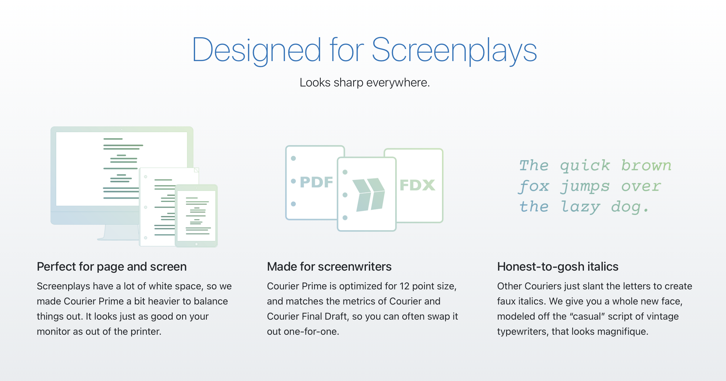
Courier Prime is a redesigned version of Courier created specifically for screenwriters by Quote Unquote Apps. It's built for readability on both screen and in print — with improved spacing, punctuation, and a bold weight that actually looks bold (original Courier's bold is notoriously weak). It's free to download and is the best choice for any writer who wants their script to look as clean and professional as possible.
Courier Final Draft is a proprietary variant bundled with Final Draft software. It's functionally identical to standard Courier for formatting purposes.
The bottom line: any of these will be accepted by any reader, contest, or production company. But if you're choosing freely, Courier Prime is our favorite because it's the best version of Courier available. What makes it the best? Who knows!? It's subjective. But it is also free, so make up your own mind about it.
Speaking of which... here's the official plug:
Courier Prime: The Best Screenplay Font for Modern Writers
Since the beginning, screenplays have been written in Courier. Its uniformity allows filmmakers to make handy comparisons and estimates, such as 1 page = 1 minute of screen time.
But there’s no reason Courier has to look terrible. We set out to make the best damn Courier ever.
We call it Courier Prime. And you can download it for free!
Courier Prime is also available in an italic variant designed to be more readable than standard Courier italic, which can be difficult to distinguish from the roman weight on screen. There's also Courier Prime Code, designed for scripts that include technical notation, and Courier Prime Sans for non-screenplay writing. All variants are free and open source.
Frequently Asked Questions
What font size do screenplays use?
Screenplays use 12-point font, always. Adjusting the font size — even slightly — is immediately noticeable to experienced readers and throws off the visual rhythm that professional readers expect from a properly formatted script. Some writers try shrinking their font to compress a long script; this never works and always gets noticed.
Can I use Courier Prime instead of Courier for my screenplay?
Yes, Courier Prime is an acceptable substitute and is widely used. It's slightly lighter in weight than original Courier, which some writers prefer for on-screen reading. For the best of both worlds, Courier Prime offers improved readability while maintaining full compatibility with standard screenplay format.
Is there a free screenplay font I can download?
Yes: Courier Prime, created by Quote Unquote Apps, is free to download and is the highest-quality Courier variant available for screenwriters. It's open source and works in any screenwriting software that allows font customization, as well as in Final Draft, Word, and Google Docs.
Do professional screenwriters use Courier?
Yes. The exceptions tend to be writer-directors with significant industry leverage — the Coen Brothers' circulating drafts are a well-known example of non-standard formatting. For anyone writing a script, Courier 12-point is the expected and required standard.
Does the font I use affect how my screenplay is perceived?
Yes. A non-standard font signals to readers — often before they've read a single line — that the writer is not familiar with industry conventions. In a competitive submission environment where readers are looking for reasons to move on, formatting errors of any kind work against you. Courier 12-point removes that obstacle entirely.